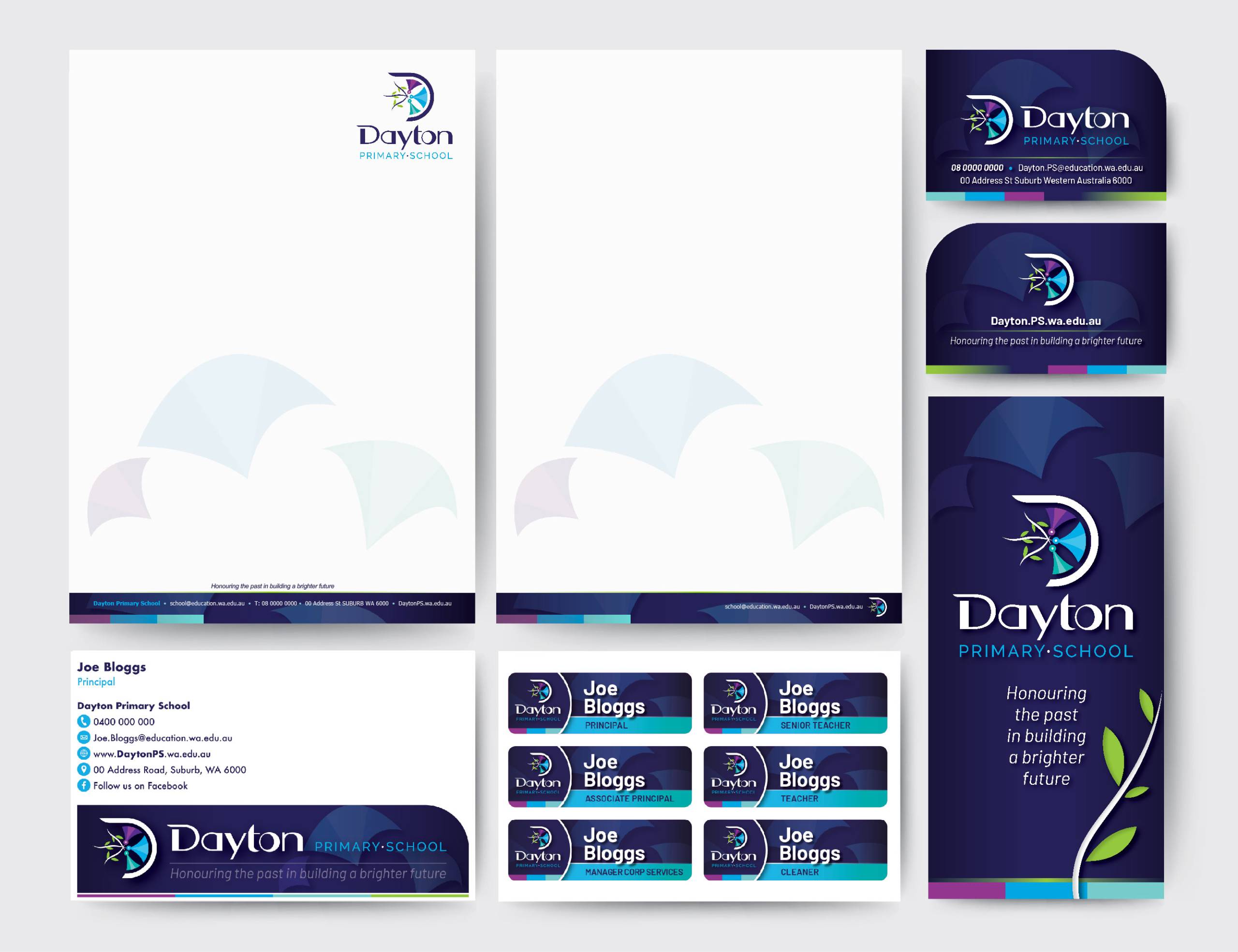
Dayton Primary School, which opened its doors in 2023, became a delightful project for us as we collaborated to shape its unique brand identity. Witnessing the school’s vision come to life has truly been a pleasure. Together with the school, we crafted a logo that beautifully reflects their essence and resonates with the spirit of their community. The prominent D shape in the logo represents both the community and the school’s name. This D also symbolises a wheel, signifying the high-quality education that propels all their students forward in life. The blossom/flower elements within the D symbolise belonging and togetherness, aligning with the vision of unity. The three softer triangle shapes represent gum tree blossoms, symbolising growth for the child, family, and school community.
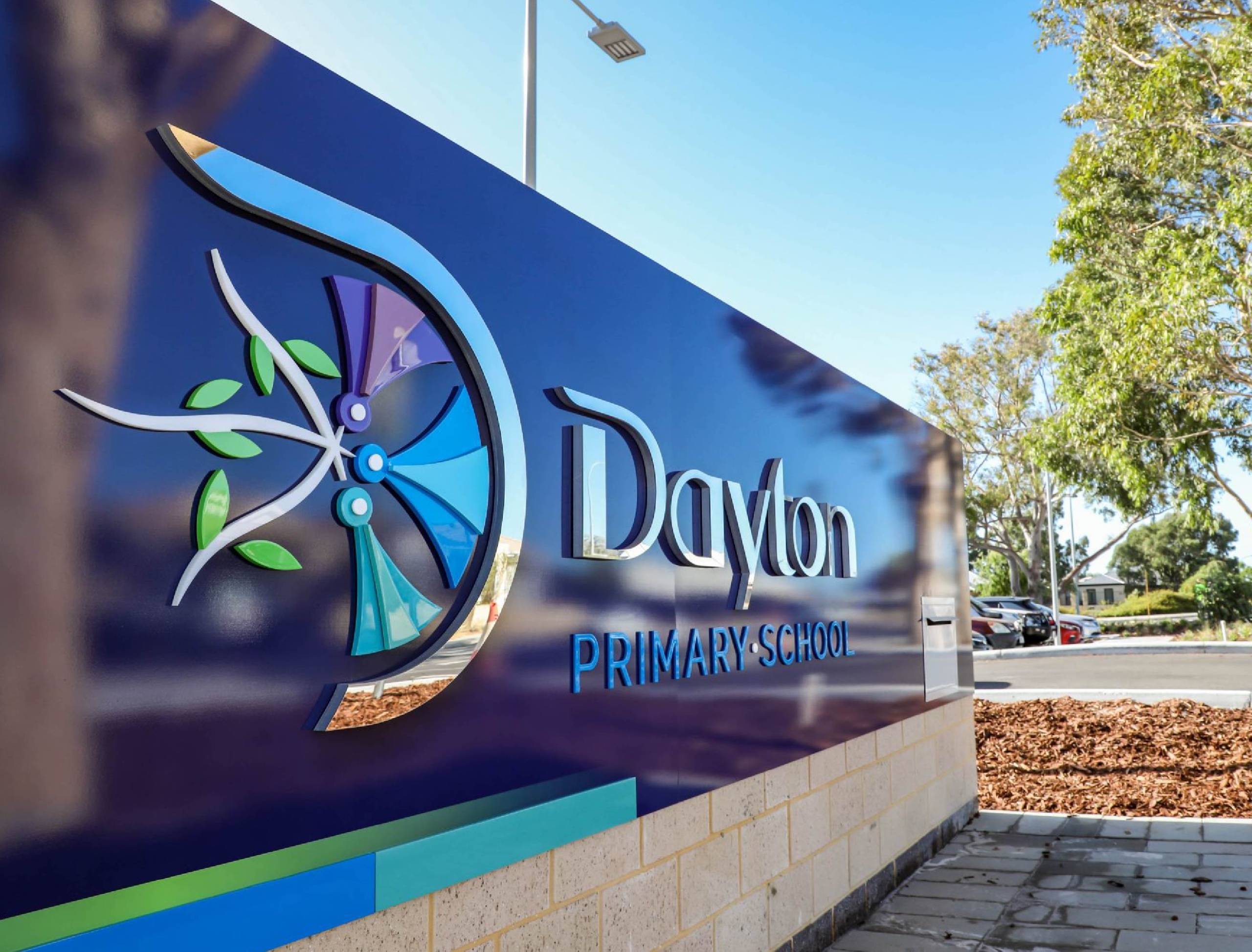
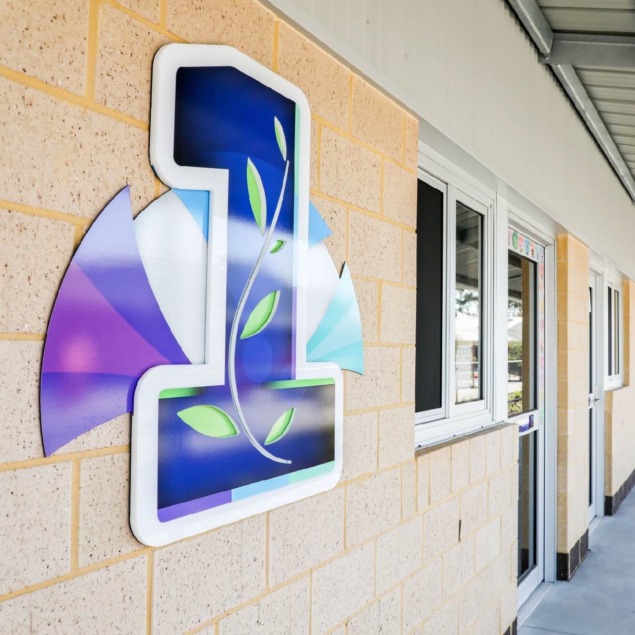
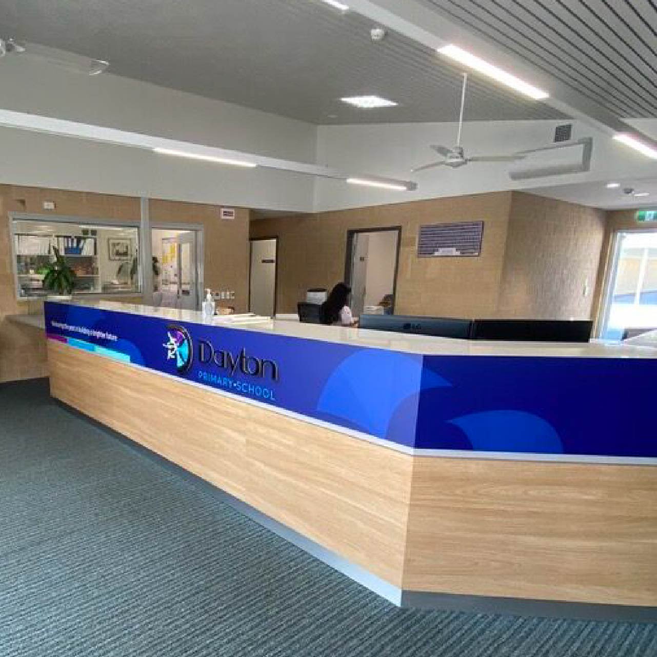
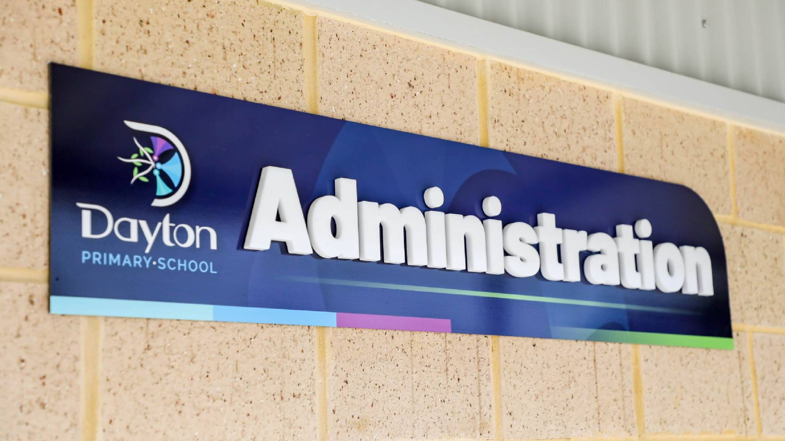
The interconnected branches signify their dependence on each other, strengthening the community like spokes in a wheel. Green leaves represent new growth and innovative ideas, embracing the essence of ‘ubuntu’ (I am because we are). The colours, drawn from the prospectus, unify the school’s branding, creating seamless interconnectedness. Since the creation of this logo, we have had the pleasure of creating a seamless brand for Dayton Primary School including their entry signage, reception desk, block signs, door plates, name badges, stationery and much more.